Case Study: Trust-First UX for AI-Driven Scheduling
Elevating decision logic from a workflow feature to a reusable platform capability
2026 – Product Design Consultant
Role and scope
Role: Product Strategy Consulting
Focus: Trust and control UX for AI-driven scheduling operations
Overview
A stealth healthcare startup had built an AI-driven scheduling platform for home healthcare agencies, operating in 26 states with a growing customer base. The AI could autonomously match caregivers to patient visits based on certifications, availability, geography, and preferences. Adoption was hitting a ceiling, not because the AI was wrong, but because it was opaque. Nobody trusted it. I was brought in as a Product Design Consultant to define Phase 1 product direction. No existing design system. No established patterns. No direct user access. High ambiguity, tight timeline.
The Problem
Three structural failures were compounding.
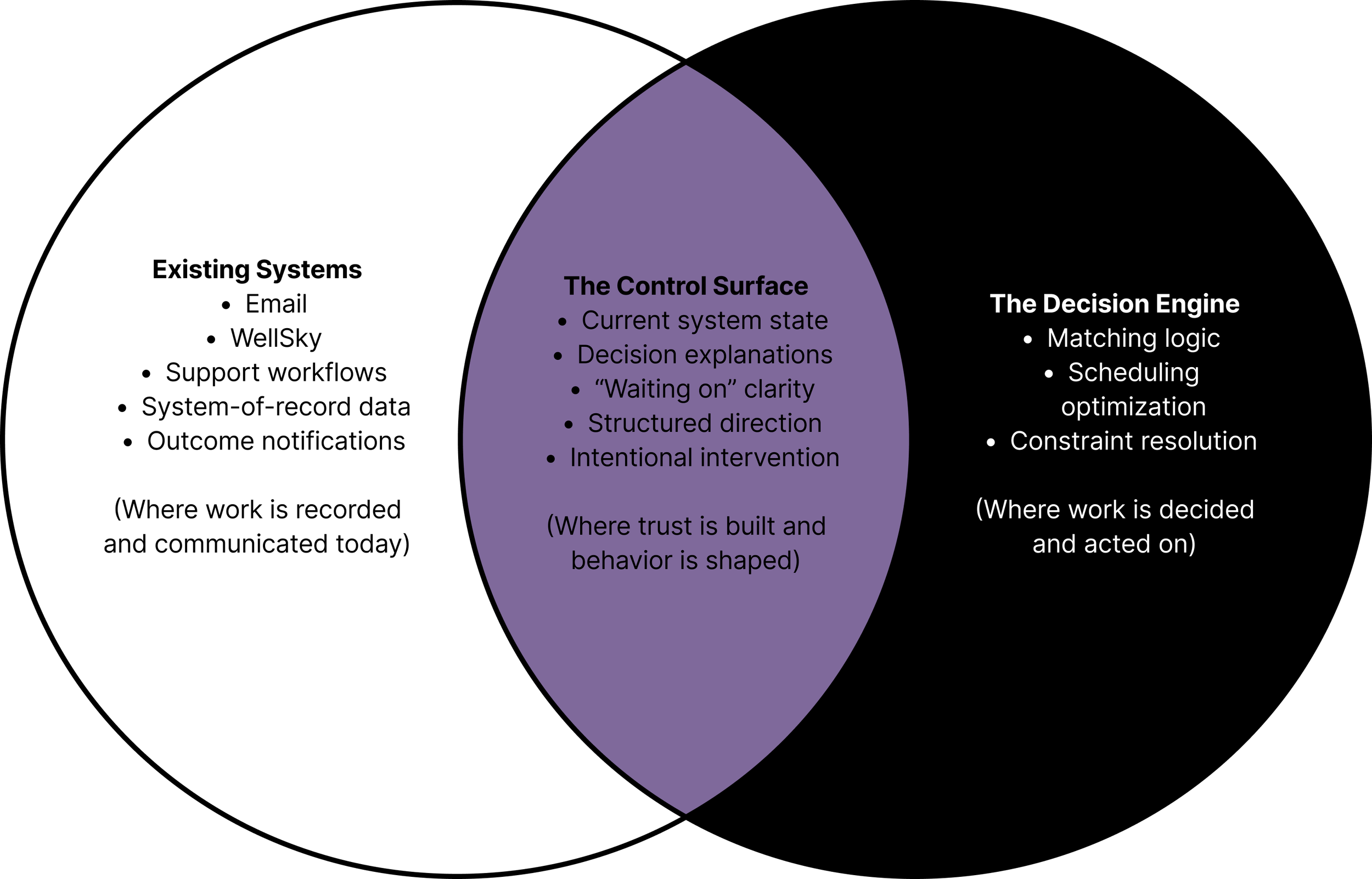
Email as UI. The entire interaction surface was email. The support inbox doubled as dashboard, command line, and trust proxy. Users didn't know what they could ask, what was fast versus slow, or what was a supported feature versus a favor from the ops team. This wasn't a UX gap. It was technical debt masquerading as a product.
Context fragmentation. Experienced schedulers think holistically. They batch-assign across weeks, hold soft preferences in memory, navigate unwritten rules about which caregivers work well together. The AI operated shift-by-shift. Even when individual matches were sound, the outputs felt disconnected from how schedulers actually work.
Role misalignment. Agency owners and schedulers have fundamentally different relationships with the AI. Owners want ROI, coverage rates, and periodic check-ins. Schedulers want real-time shift-level control. Both were being served through the same undifferentiated email channel.
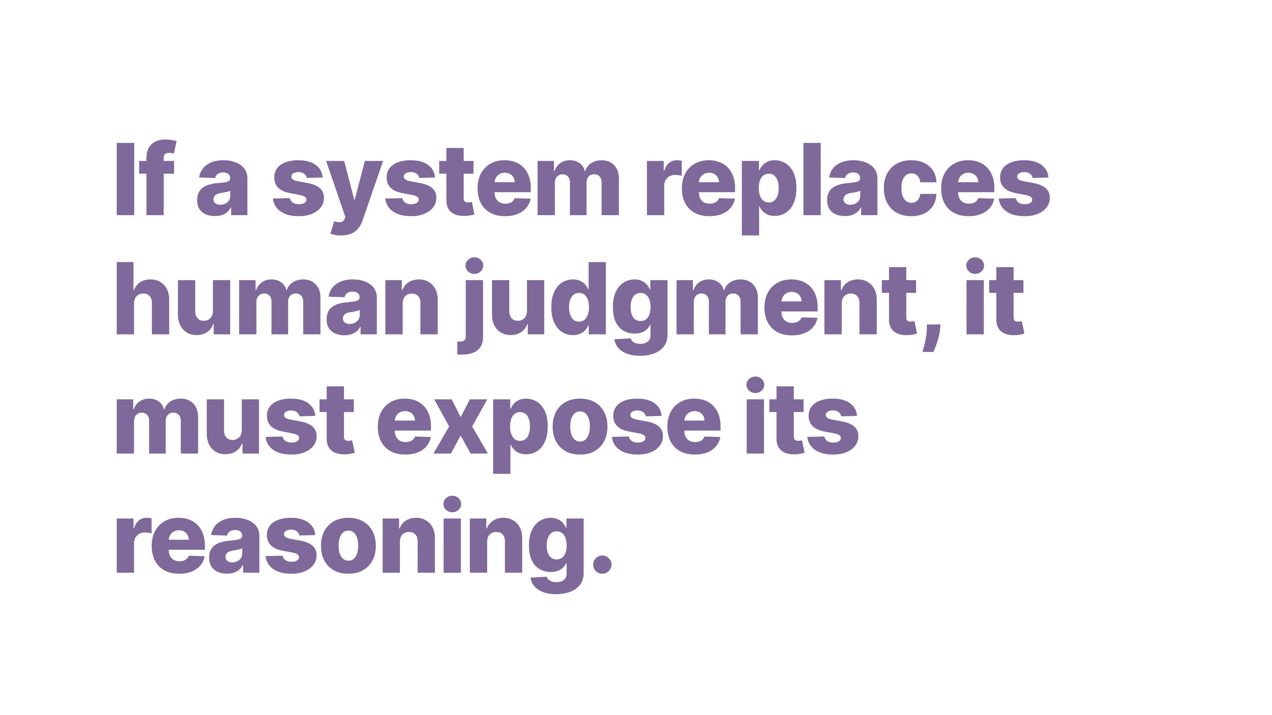
The deeper issue: the product had no way to make the AI's decisions legible. Trust erodes when you can't see what the system is doing, can't understand why, and can't correct it when it's wrong.
Research Approach
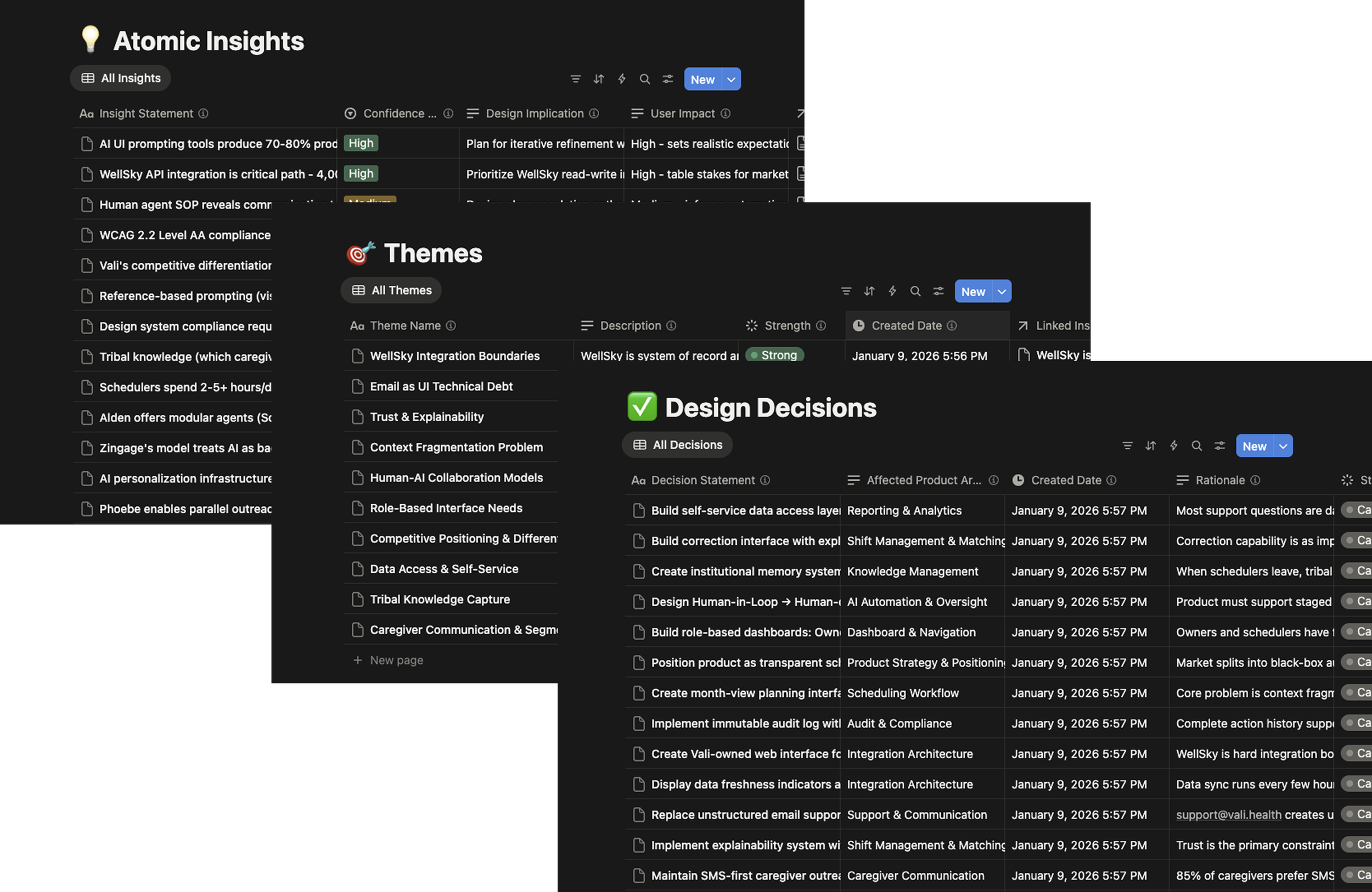
I built a multi-tool research pipeline, using AI tools for rapid competitive scans, citation-heavy domain research, and synthesis, with Notion as the relational database. The goal was to compress the time between raw input and structured output without replacing design judgment.
Research generation produced 13 structured reports across five categories: competitive intelligence, organizational structure by agency size, UI adoption patterns, persona development, and trust frameworks. Each report had explicit source validation with primary sources prioritized, 80%+ recency, and 339+ citations total.
Six internal interviews across product, engineering, ops, and customer success were mapped against external research to surface alignment and divergence. Everything was broken into 250+ discrete, tagged, evidence-backed observations stored in a relational system, then clustered into ten validated themes. Every design decision traces back to supporting evidence.
Themes became a product specification. Not a deck to be interpreted, but a working document to build from. Component definitions, navigation architecture, trust patterns, exception workflows, phased roadmap. Total elapsed time: roughly three weeks.
Design Goals
Make the AI's reasoning legible without exposing internal logic. Establish interaction boundaries that email couldn't provide. Serve two fundamentally different user mental models (owners and schedulers) without forcing them into a single adaptive interface. Create a trust graduation path from human-confirmed to human-monitored AI operation. Define a specification concrete enough to build from, not just present.
What I Designed
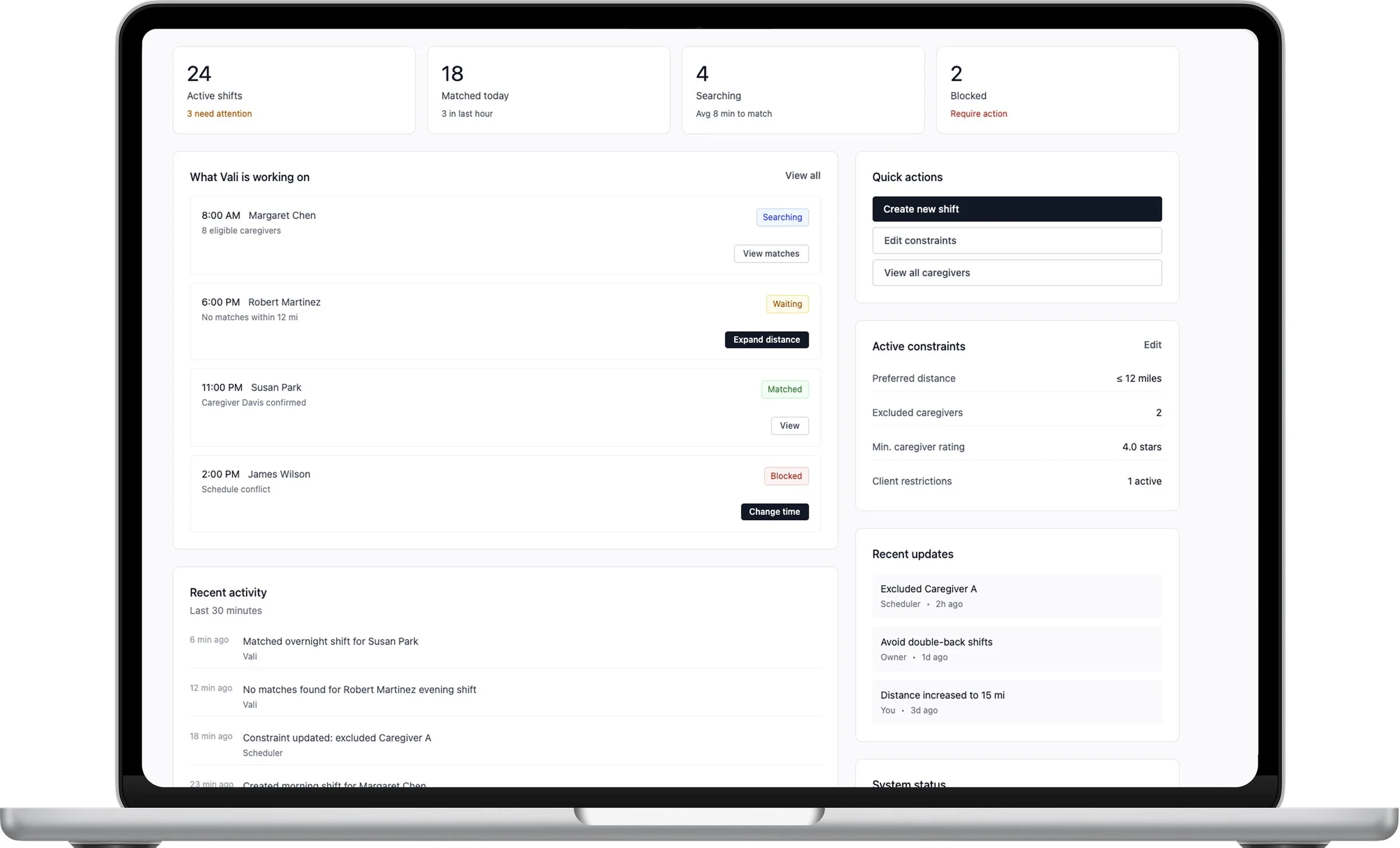
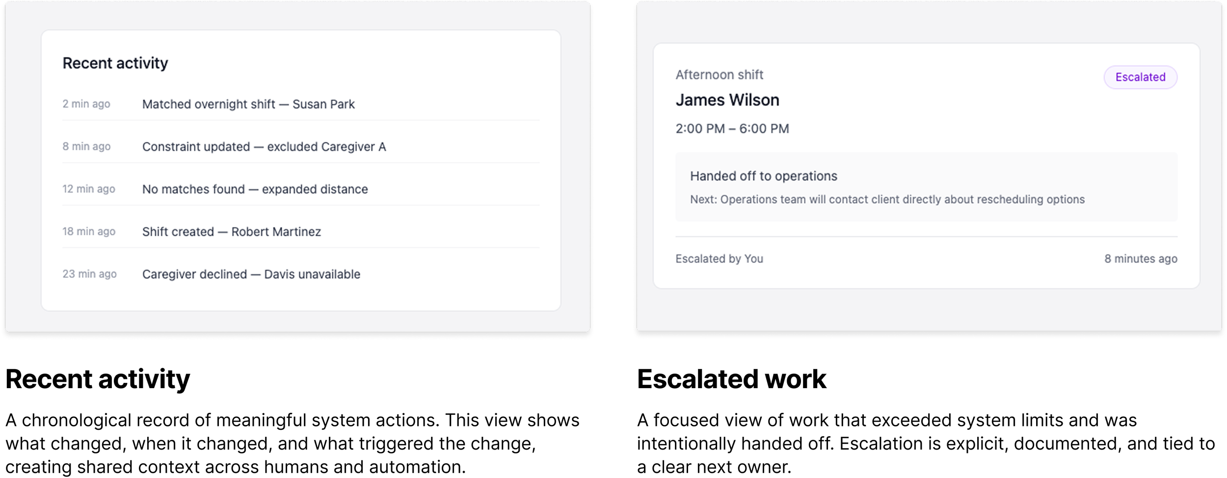
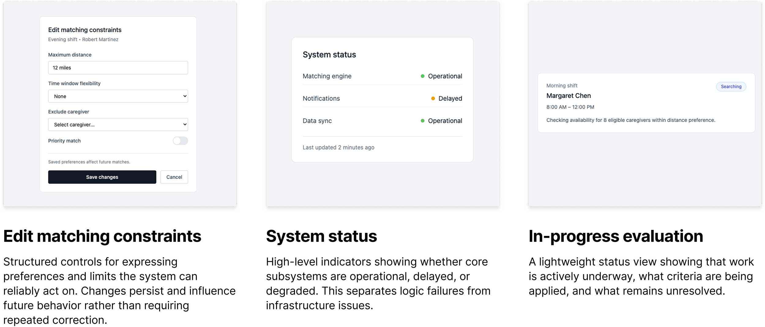
Decision Rationale Drawer (Progressive Disclosure): The AI always shows the primary reason for a decision in plain language. One sentence. If the operator wants deeper insight, they expand a reasoning panel showing all criteria evaluated, which candidates were disqualified and why, and the confidence level. Corrections feed back into the system's learning. The interface treats the scheduler as someone who already understands scheduling. It shows reasoning in operational terms, not ML terminology. Transparency is available, not forced.
This resolved an organizational tension without requiring either side to accept risk they shouldn't. Engineering stopped worrying about exposing a flawed algorithm because we were showing criteria, not internals. Product stopped worrying about a black box because transparency was a deliberate choice.
Guided Requests Interface (Replacing Email): Structured request categories with clear response-time expectations and explicit capability boundaries. This doesn't just improve efficiency. It establishes interaction boundaries. The absence of those boundaries was itself a trust problem.
Role-Based Dashboards: Instead of one adaptive interface trying to serve two mental models, two dashboards with entirely different information hierarchies. The Owner Dashboard provides aggregate metrics: coverage rate, trend lines, cost impact, alignment with stated constraints. The Scheduler Dashboard provides real-time operational control: shift status, exception queues, pending decisions, outreach summaries, inline correction. Same system, different lenses.
Trust Graduation Model: Human-in-the-Loop (HITL) progressing to Human-on-the-Loop (HOTL) as confidence builds. In HITL mode, the AI recommends but the scheduler confirms every assignment. As the system demonstrates accuracy, the agency can optionally shift to HOTL, where the AI executes routine assignments autonomously while the scheduler monitors exceptions. Override authority is always preserved. The graduation is never forced.
Constraints
No direct user access (stakeholder interviews only). No existing design system or established patterns. The AI was functional but its decision-making was not surfaced anywhere in the product. The company was pre-product in terms of designed interfaces, operating entirely through email and manual coordination. Timeline was compressed to three weeks for the full specification.
Outcomes
Complete Phase 1 product specification delivered: system constraints and architectural principles, nine core interface components with interaction behavior and role-aware visibility rules, three personas with behavioral trust models, exception-handling workflows, navigation architecture, eight product principles, fourteen design decisions (all traceable to evidence), and a phased roadmap with validation criteria.
The specification was designed to be consumed by product managers and engineers directly. It's infrastructure, not documentation.
Honest Limitations
The specification front-loads definition over validation. In a longer engagement, I would want to prototype-test the Decision Rationale Drawer and the HITL-to-HOTL graduation model with actual schedulers before locking the spec. The research strongly suggests these patterns are right, but "strongly suggests" is not "confirmed with users."
I had stakeholder interviews but not direct scheduler access. I compensated with structured competitive analysis, domain literature on trust in autonomous systems, and explicit confidence tagging on every insight. The specification is transparent about where evidence is strong versus where it's inferred.
Conclusion
This is a compressed example of how I work: high ambiguity, tight timeline, no existing design system, and a problem that isn't "design the screen" but "define the system." The atomic insight model prevented premature pattern-matching. The research pipeline allowed institutional depth on startup timelines. And the trust-first framing reoriented the entire team from "How do we hide this?" to "How do we make this trustworthy?"